Seltzer Rebrand
Role: Creative Lead, Brand Strategy, Campaign Visuals
Scope: Brand Differentiation, Campaign Visuals
Overview:
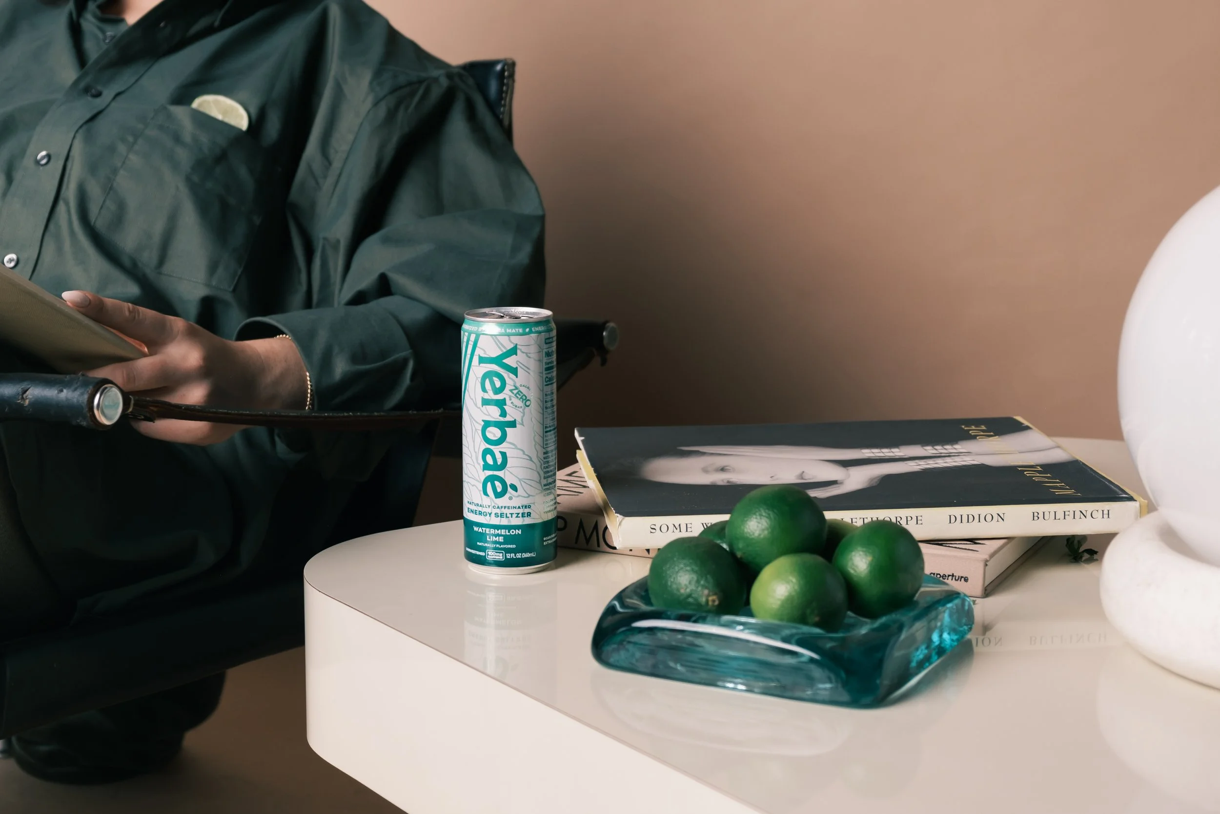
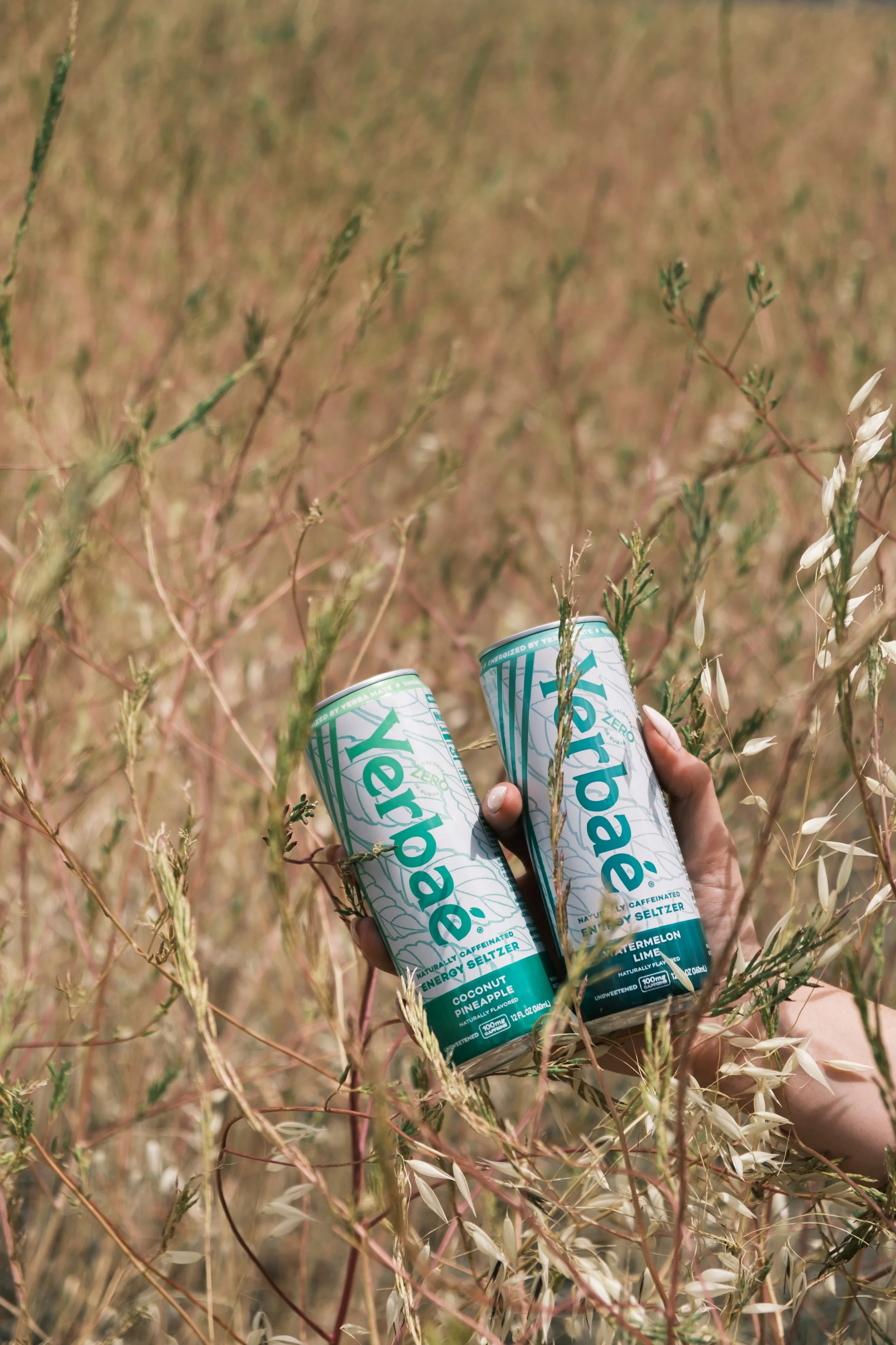
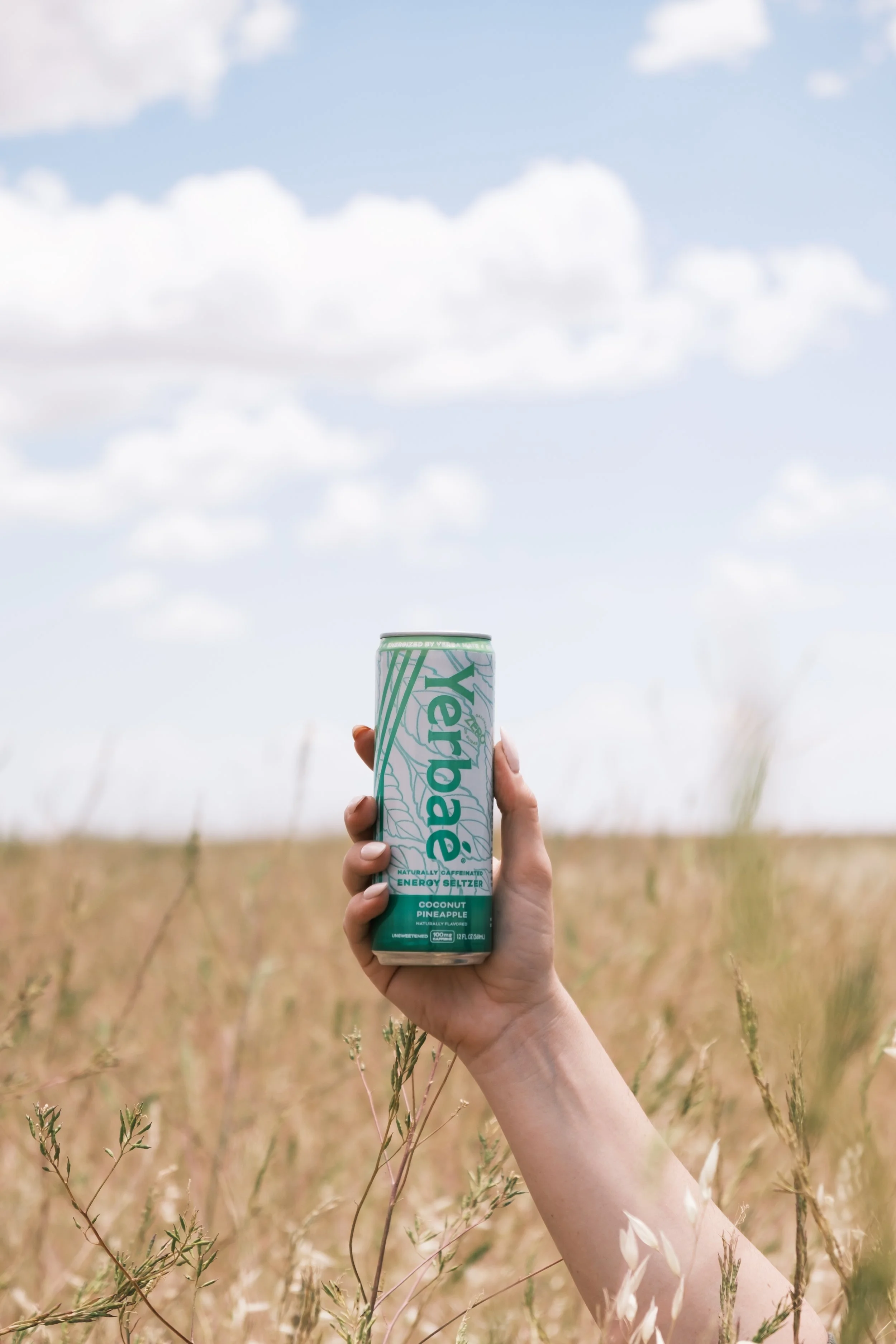
Yerbaé approached this project with a clear challenge: their two seltzer product lines were blending together visually, limiting shelf differentiation and weakening consumer recall. The brand needed a stronger identity system that clarified each line’s personality while maintaining overall brand cohesion. I led the creative strategy and visual direction to redefine how each product line showed up in the market.


My Approach
01
Defined Strategic Positioning
I started by identifying the emotional territory each line could own. Instead of redesigning for aesthetics alone, I created two distinct personality directions rooted in audience mindset and use-case occasions.
Rather than thinking in single-label executions, I developed scalable visual systems, which include; color architecture for stronger shelf blocking, typography hierarchy for instant readability, graphic elements that felt bold but modern and lifestyle cues embedded into visual storytelling
02
Built Visual Systems, Not Just Packaging
03
Led Creative
Execution
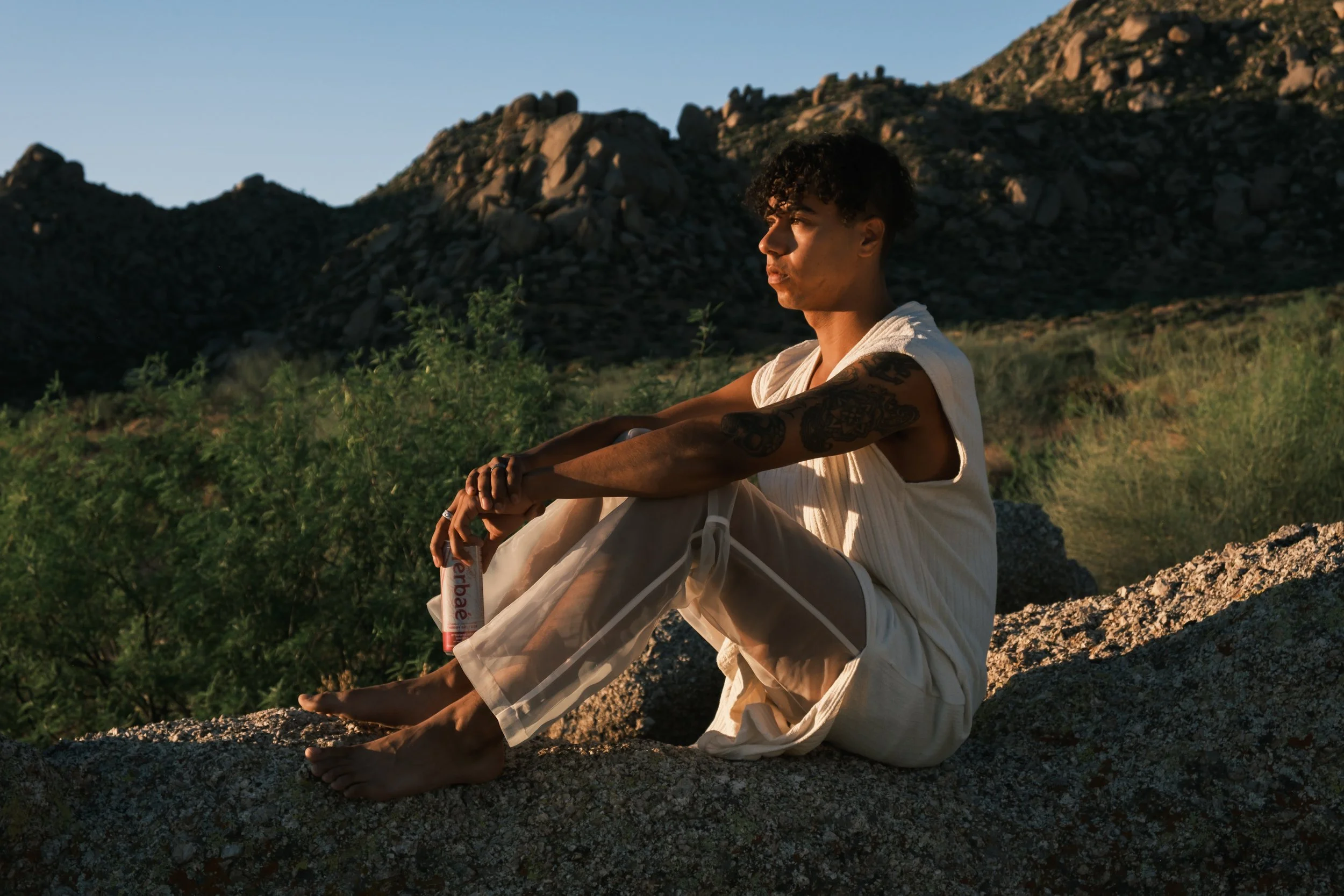
I oversaw packaging direction, design iterations, visual mockups, campaign photography alignment


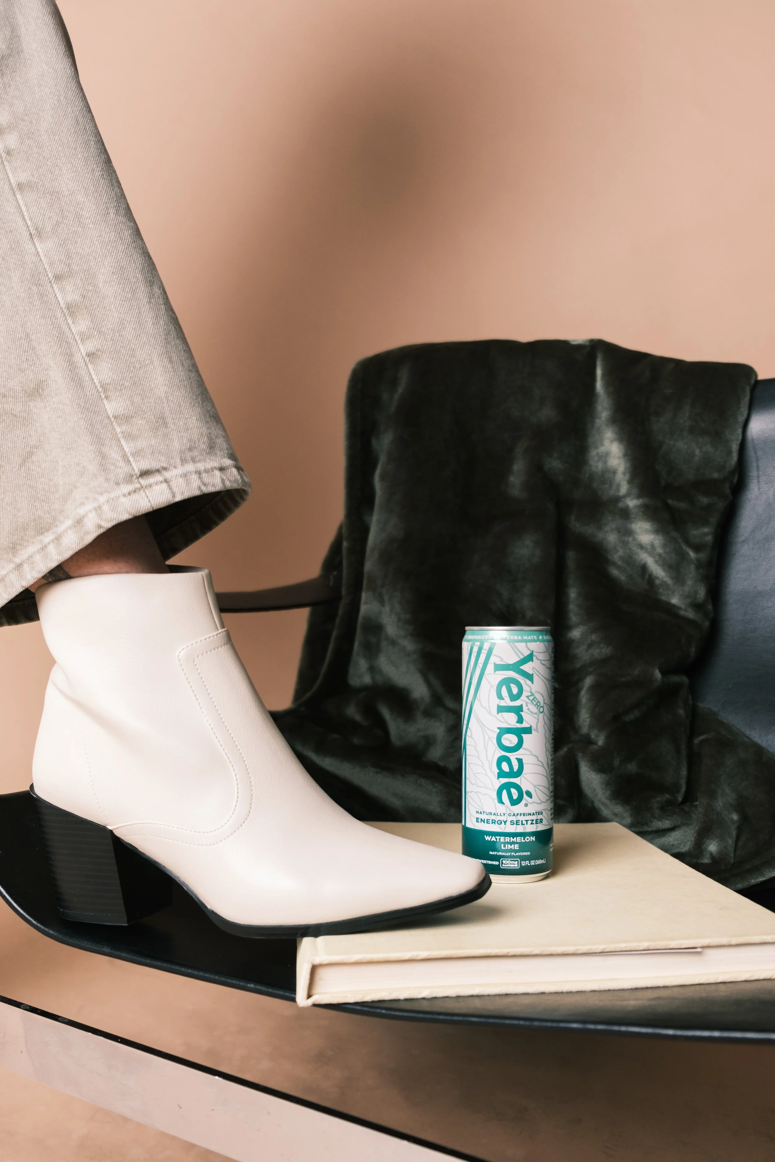


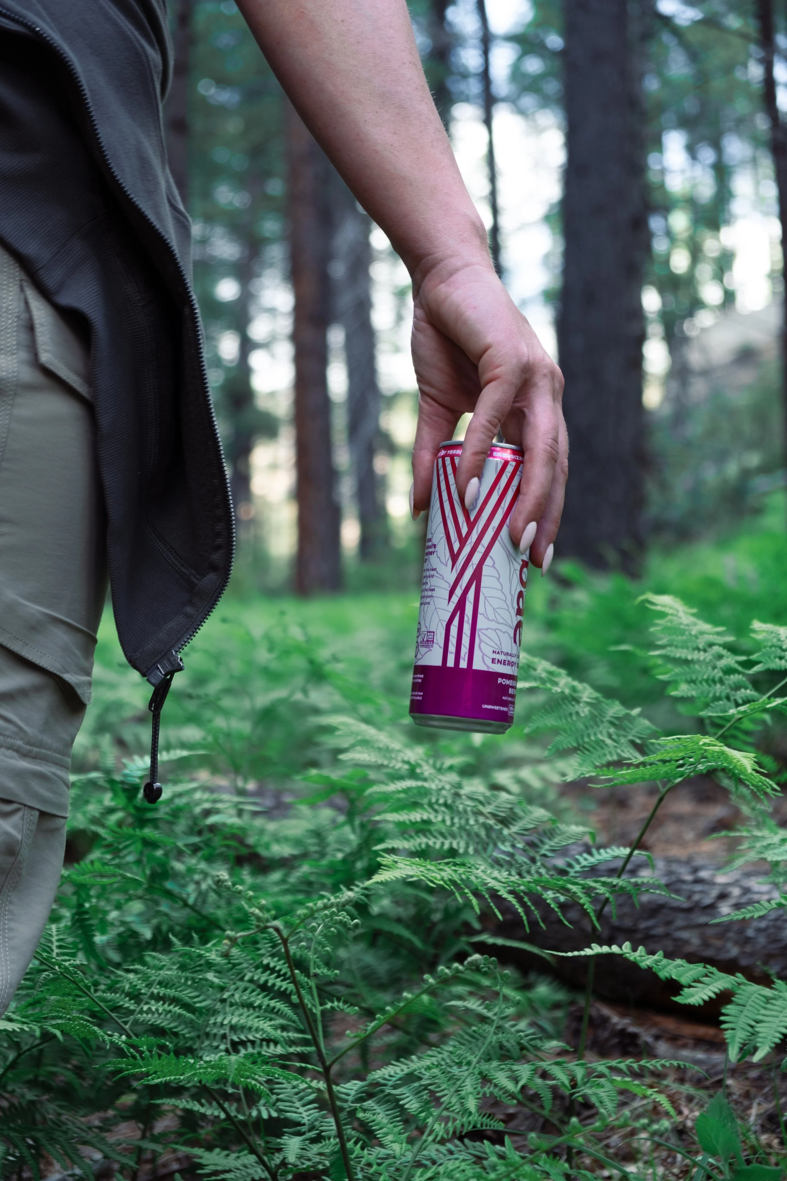
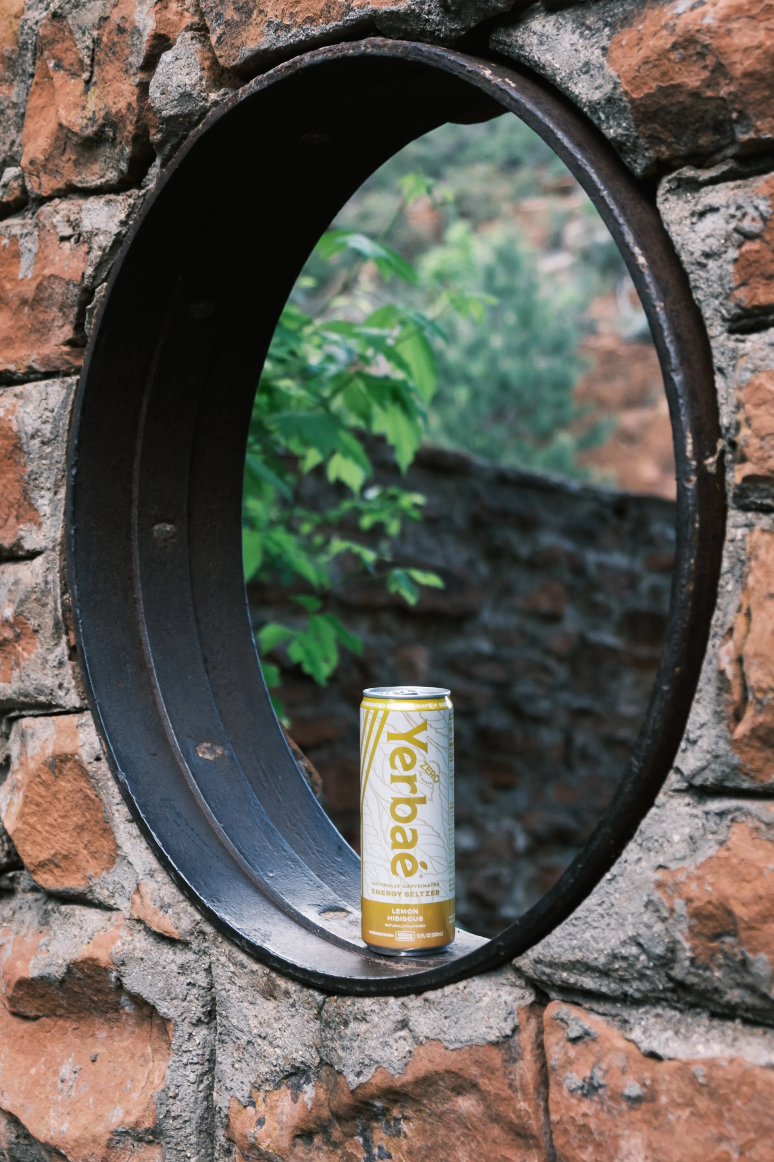


Clear visual separation between product lines
Stronger shelf presence and brand distinction
Elevated brand maturity through cohesive system design
Improved storytelling across marketing materials
Outcome & Impact

This project reinforced the importance of designing beyond aesthetics. Packaging is not decoration — it’s strategy. Strong visual identity directly influences perception, memorability, and purchasing behavior.